As the end of a class draws nearer, the final culminating project is faced. For everyone, its the final chance to prove and show all the skills and abilities you have in the media arts. For me, I had to come up with a piece of artwork that would en-capture all my top skills that I have and create something that would show my theme and focus on something I really enjoy. With all these things in mind, I decided to create a deck of playing cards, with an Alice in Wonderland theme.
At the beginning of the semester, I had this clear idea and thought in my head to create something with Alice in Wonderland, as I really wanted to do something with faces and flowers; like the talking flowers that Alice encounters. Although I didn’t end up using this idea in my final piece, this first thought became the start in my creation process. While further developing my artwork and what it should be, I thought it would be a good idea to take the Alice in Wonderland theme, and with the playing card characters in mind, actually create a deck of cards. While looking up different types of artwork done in this theme, I happened to stumble across a new beginning artist names Juan Solorzano, who created his own version of cards. He became a main source of inspiration in my own design and create process.
**ALL IMAGES OF THE CARDS ARE FOUND FOLLWING ALL THE WRITTEN INFORMATION**
The deck of cards itself is all hand drawn by me. I decided to go with the more recent version of Alice in Wonderland, also known as the Tim Burton one. I decided to go with this version as it goes and connects with the dark theme/style I have come to create over the semester. Burton’s movies tend to have a dark, eerie feel, and because of this I felt it would work well and connect to my own artwork. The cards were drawn own Adobe Illustrator using the pen tablet. I decided to use this program and tablet because, as a drawer, I can really excel in this area and I’ve learned how to and can use the tablet very well in my favor. The backs of the cards are all coloured in a red and pink monochromatic colour scheme. The cards ranging from ace (one) to ten of each suit are all the same in the sense of they all have the box cover on them. I decided that this was a good way to put an image on each card that helped make them all go together. The Jack, Queen, and King of each suit has their own individual character on them ( Hearts: K- Knave of Hearts, Q- Queen of hearts, J-Playing card, Diamonds: K- Alice, Q- White Queen, J- Mad Hatter, Clubs- K- Absolem (caterpillar), Q- Doormouse, J- Tweedle brothers, Spades: K- White rabbit, Q- March hare, J- Cheshire cat). This makes each card unique and a set by grouping particular characters together (ie, the suit of hearts has the Queen of Hearts and people part of her castle on them). One thing that turned out very successful is that weathered paper wash that was placed behind the drawn characters. I feel that this masked behind them added to the cards by making them feel more realistic and aged.
During this culminating process, one had to create the piece of artwork using two or more principles of Media Art, which are hybridization, duration, interactivity, and point of view. In my set of cards, I used the principles of interactivity and point of view. How interactivity connects to my artwork is that the viewer can actually pick up the deck of cards and play with them. By being able to physically touch, hold, feel and play with them allow the artwork to be interactive. Also, by making a box for the cars to go in make in interactive, as you have to take the cards out of the box, not only to look at the artwork and designs found on the cards themselves, but also to play with them. The other principle is point of view; this principles also connects and can be seen in my artwork. It can be seen in the cards, and more correctly, on them. The main point of view is of Alice. There are three different angles of her that describe and create this principle. Firstly, on her card of Diamonds, she as seen as normal sized. Secondly, she is seen twice on the box and on the numbered cards. On the front of the box, as well as the cards, she is seen as when she is very tiny, as she’s looking up at Absolem from a mushroom. On the back of the box, she is very large, at the moment when she eats the growing cake, where she’s too big for the room. By showing her at the different moments of her growth throughout the movie allows this principle to be shown. However, with this in mind, I had planned to do a lot more with P.O.V. My original plan was to draw characters and scenes onto the numbered cards to further add to the overall look. I wanted to draw characters in different moments throughout and various little objects and creatures, but, in the time period I had, I was unable to do this.
I feel that in my artwork there are some visible strengths that can be seen. Firstly, I feel that the overall creation of cards is very well done and a great idea. I myself have never seen such a thing created and find that it is a truly unique idea. I also feel that my drawings are a major strength. My drawing skills on the tablet have grown greatly and I’ve really come to terms with the tablet and how it works best for me. I found I was easily able to draw as good as I could with pencil and paper as I did with the tablet. My skills have defiantly grown since the last major artwork I created using the tablet (Unraveled Thoughts). Another strength I feel is the back of the cards. I feel that I was very able to create a patterned that you would find on the back of any normal deck of cards; because of this key point, I feel that it enabled to the cards to look even more realistic.
However, with strengths come weaknesses, and there are some found in my artwork. One weakness that I find in my cards is the sizing of the characters. Since each character is in a different position, I didn’t realize until after I placed them on the card how small some of the characters would be/fit in the given area. Two main examples of this is the Tweedle brothers (jack of Clubs) and the White Queen (Queen of Diamonds). For the Tweedle brothers, their final drawing made them wide and short; since they were longer wide, they had to be shrunk down to fit in the given space. Like this, the White Queen had to be smaller then some of the other characters, as her elbows were out, thus making her only able to fit in a certain yet smaller place on the cards. A big weakness overall was the lining up of the cards. This goes hand in hand with the things that I would change if I were to do it all again.
If I were able to do this project all over again I would do many things differently. The main thing that I would do would be to learn the printer better. What I mean by this is, since I was printing double sided, I had to make sure everything lined up perfectly. To do this, I created “rulers” on the pages on the computer, all with equal measurements on all sides to make them line up. However, when I printed the cards, the rulers ended up not doing anything at all; thus meaning they didn’t line up. This was a huge problem because, if I were to cut them out, parts of one side of the card would be majorly cut off. So back to the creation/drawing board I went. I had to reline and arrange all the front sides of the cards and print off many sheets of the same pages, but with large or shrunk characters, all moved over mm by mm, all trying to get them inline perfectly. This would be my main focus if I had to redo this project, so I wouldn’t have to deal with the mishap at the end like I did. Another thing I would do would be to simplify all the characters even more, thus allowing me more time to create a drawing that’s unique for each numbered card.
Overall, I am very pleased with how the cards turned out! I couldn’t be happier with the results I got! I haven’t decided if I want to play with them, or frame them, but either way I want them to be seen and appreciated for the masterpiece(s) they are. With all this in mind, at the moment, I don’t think I want to look at another set of cards for a long while. But, I’ve got lots of positive feedback from both teachers and fellow students, so this makes the idea of cards a little more bearable at this time. And who knows, with all these good things, maybe one day I’ll even market them!

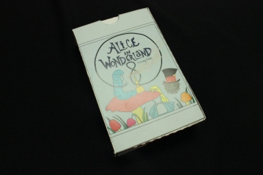


Overview off all 52 cards and box

Clubs: Jack – Tweedle Brothers, Queen – Doormouse, King – Absolem

Spades: Jack – Cheshire Cat, Queen – March Hare, King – White Rabbit

Hearts: Jack – Red playing card, Queen – Queen of Hearts, King – Knave of Hearts

Diamonds: Jack – Mad Hatter, Queen – White Queen, King – Alice
