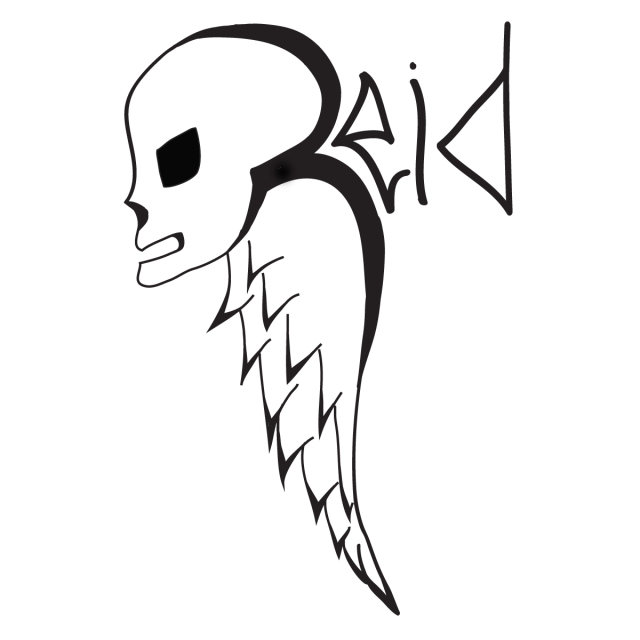
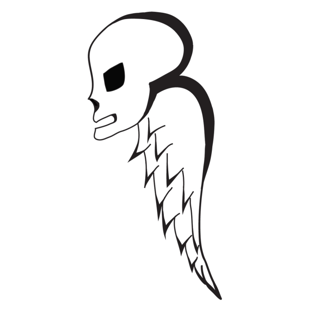
Logo Design for Melissa Reid Creations.
Adobe Illustrator
From creating and representing a business, to designing a signature for your own work, logos do a variety of things in a persons life. The task I had to do was to create a logo and logotype for either a business, or my own personal use; I decided to create a logo to use as my signature in my artwork. During my thinking process, I had to think about the four characteristics of a good logo as well as somethings that’s practical and representing of me. After filling four pages of sketches and mock-up designs of skulls, wings, fonts, and so much more, I finally came to the logo idea of a skull with a wing beside its head stretched downwards; hidden in plane sight in this design is an encapsulated uppercase ‘R’. This ‘R’ is found in the skulls head and in the wing. As mentioned before, the four characteristics of a good logo are very important when creating a successful logo. One, make it unique; my logo followed this characteristic as its completely unique, stands out next to others and its design is not something over used, like arrows or globes. The second characteristic, make it appropriate, is also followed. The logo reflects and connects to the theme that my media art work is about; skulls. Thirdly, the characteristic of making it adaptable was followed. By allowing it to be successful it black and white, and keeping it simple allows for flexibility in its use. A successful logo needs to be able to be shrunk to 1 inch or stretched to a billboard with out loss in any detail, and my logo is able to do this. Lastly, I’ve made it timeless, which is the last characteristic. By the logo being so simple, with no colour added as it wasn’t needed or an overload of lines, helps make it a clean, clear image with neutrality. I decided to leave colour out of the logo as it would take away from it and make it to busy, distracting and overload the logo itself. There is no font used in the logo itself, but, a thick letter ‘R’ is found in the skull and wing itself. It it the top part of the skull, and descends down into the wing. This ‘R’ makes the logo symbolic as it represents me, myself, as my last name begins with this letter. I feel by incorporating the ‘R’ into the logo makes it more successful and meaningful to me, as it still depicts a clear image without the adding lettering used for a logo type.
 Logotype Design for Melissa Reid Creations.
Adobe Illustrator
A logotype is a logo that incorporates the qualities of a logo, but can work with icons and symbols. For my logotype, I added the rest of my last name. The lettering is drawn into the contours of the logo shape itself. The ‘e’ is drawn so that the lines match up to the lines of the ‘R’ drawn into the skull and wing.

