 11″ x 17″
Adobe Illustrator
Dudeee; Welcome to the 60’s man! Everyday, the 60’s still influence us and our pop culture, from clothing, to fabrics and more! It became a revolutionary time with many influential people, icons and more, all sticking in the minds of generations, new and old. So many people take advantage of the genre, both back in the time and today; bands of all types were a major influence of the 60’s era. They created revolutionary posters that attracted the eyes of all types of people, with the tye-dye, retro inspired theme.
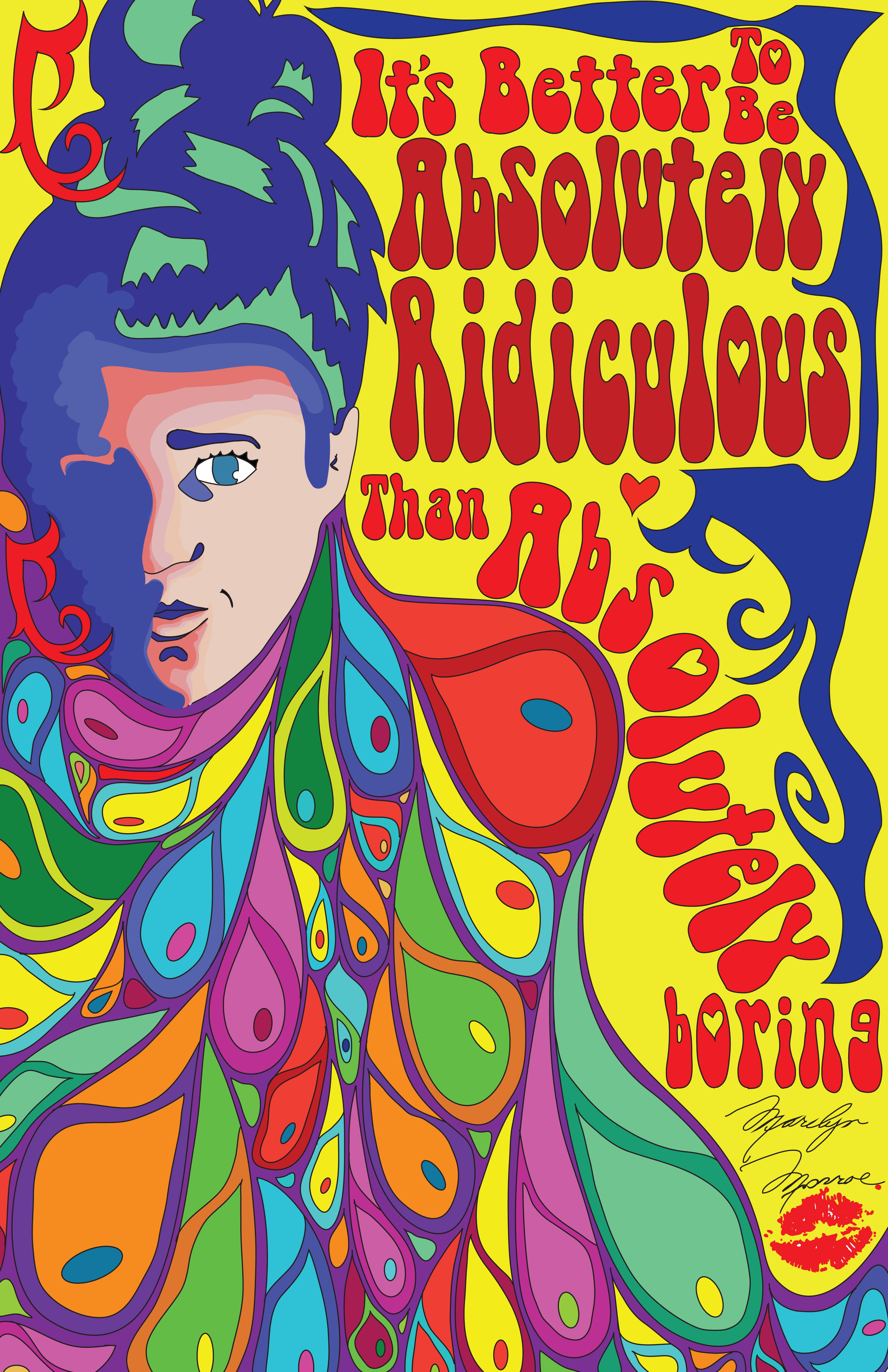
The purpose of this assignment was to create a 60’s style poster that’s influenced by the 1960 era, themes, people and more, using the black and white portrait done in a previous project as the main attraction in the piece. By taking my black and white portrait, which can be found on my blog titled “As Complex as Black and White”, and altering it in unique ways with inspiration from the 60’s era, a poster can be created, made and appreciated for 60 style art.
This piece was created on Adobe Illustrator using the drawing tool. I first imported my previously done black and white self portrait; I then altered the colours of the portrait, and painted shading into it in a graphic, rough and unique way. I then drew the waved lines and shapes coming out of my head. All of these were coloured in with bright retro colours, all in which contrasted the other and balance the opposites at the same time. I then hand drew the text in my quote. This quote was found from an inspirational person from both the 1960 era and today’s; Marilyn Monroe. I found a quote that could be applied in both today’s time and back then, and inserted her signature. To finish it off I drew her signature lip print that was placed below the quote and her name.
During both the creation and completion process, many of both the elements and principles of design can be seen to help the piece look more unified and complete and to be seen as more visually appealing. The elements that can be seen are line and colour. Line can be seen as the moving paths through space. The waved lines create movement that the viewers eyes can follow, pulling them through the whole space. Colour can also be seen throughout the whole piece. There was all the primary and secondary colours used, including a variety of their shades in different values and hues, all changing their intensity. By doing this and using a large variety of colour, the 60’s style could be portrayed. The principles that can be seen are pattern, rhythm, balance, and unity. Pattern can very much be seen throughout the piece. The waved shaped pattern is repeated and reoccurs as a design element which establishes a visaul beat. This pattern connects to the principle of rhythm. This connects to pattern as it suggests the idea of motion through the various waved and texted elements. By placing the text where it was awell allowed the viewers eyes to be followed down the waves and up through the motion of the text. Balance can be seen as the impression of an equalibrium. In my piece, asymmetrical balance is achieved and seen as the heaviness of the waved shapes and portrait are balanced by the brightness and heaviness of the waved texted. Lastly, unity; this is achieved as all the components of the artwork are seen as harmonious, giving the work a sense of completion. This was achieved by repeated the same colours throughout, and using the same waved shapes, in both the text and the waved shapes.
I decided to create my poster like this for a variety of reasons, but the main reason is I wanted to use the very inspirational quote said by Marilyn Monroe. By creating my own, unique text, I was able to use that as inspiration and unity and balance created by the waved shapes and designs. All of this together helped create a piece that was, just like the tittle says, A Wave of DIfferent Times.
Overall, I am very pleased with how the completed piece looks. All the pieces work together very well and balance each other in a good way. One challenge that I did face was the use of all the colour. I have never worked with that much colour in one piece before and found I was concerned about the amount in it to be either over whelming or to heavy compared to other colours. I found that by trying to divide the amount of space for colour helped to accomplish a product and efficient way to balance the different colours. With this in mind, I am still very pleased with how the overall piece looks, and feel that I was very successful in creating my own unique 1960 style poster.
