From a young age, knowledge has been the basis of our survival; and who does this ability begin? From learning. Since we were learning to talk, we, with our guardians at our side, was thrown into the world of learning of words and pictures. As we grow, our abilities widen, and everyone can recall a time where they found them selves nose deep in a dictionary, trying to learn how to spell a word correctly, all to get that A+ on the spelling test. This stage and memory in our lives has been a big one, that can be seen from past generation to future ones. So why not create art out of it?
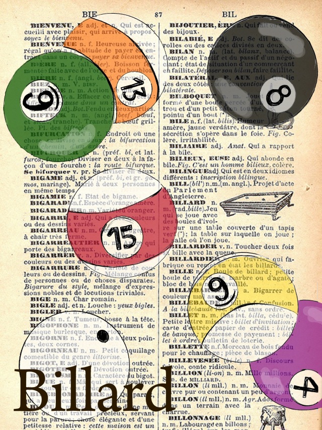
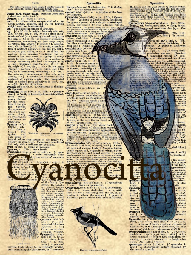
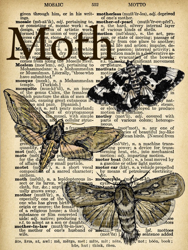
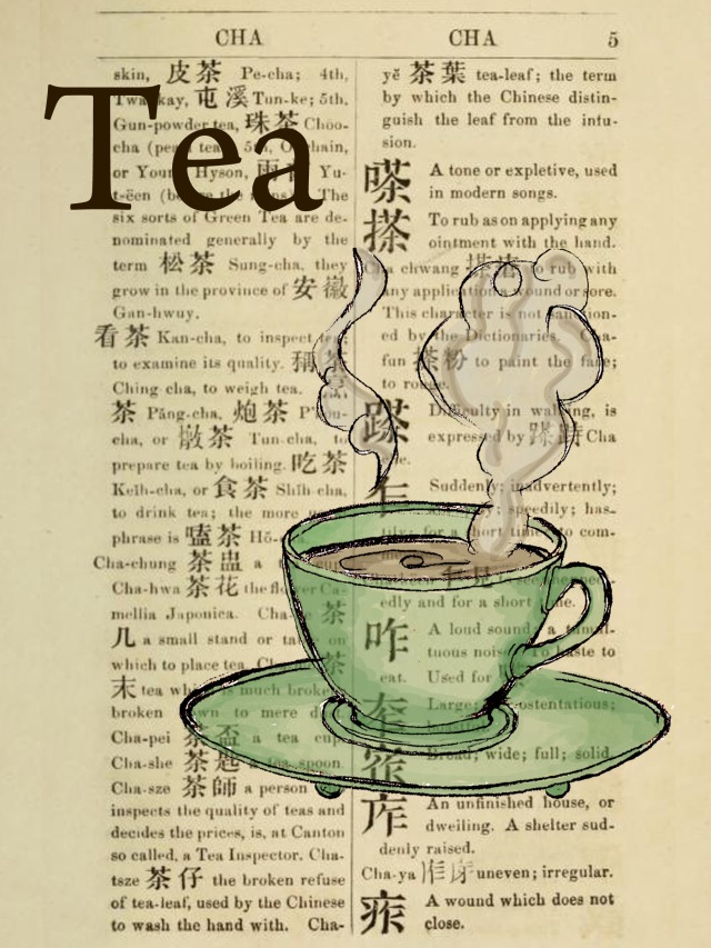
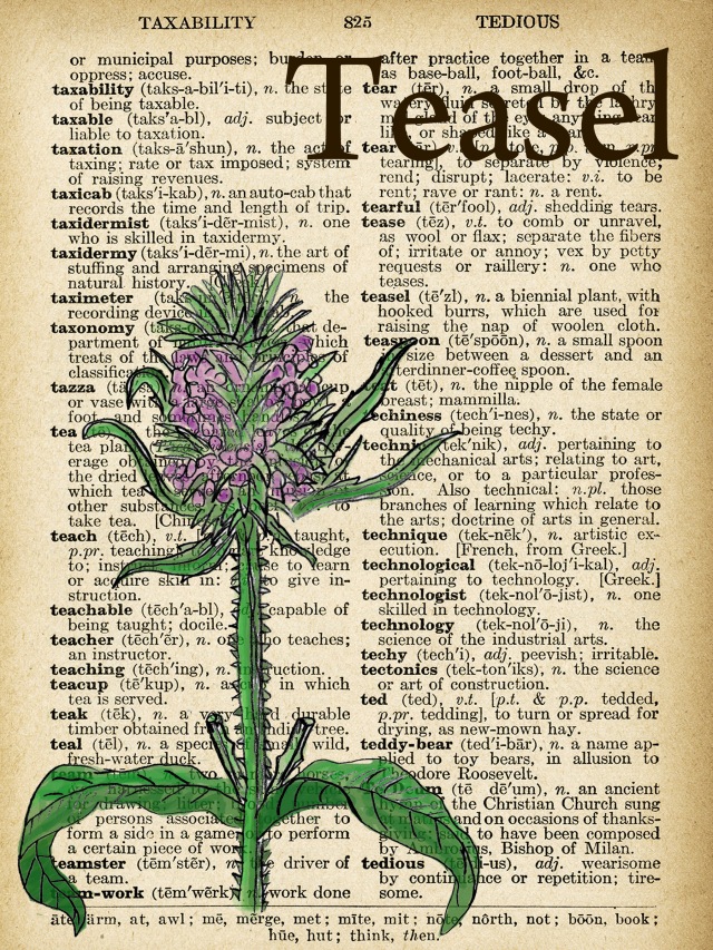
As an artist, I’ve always yearned for the chance to create such creative art works that combine text and imagery, known as dictionary art. This style of art itself has grown on the popularity charts for years, and is becoming even more popular as wall décor as simple, yet elegant modern art. For my creation, I decided to create a series of five pieces. Each piece itself is completely different from the next, but as a whole, fit perfectly to the whole. As seen below, there are a variety of subjects created; a billiard theme, a moth theme, a plant (teasel) theme, a (Chinese green) tea theme and a bird (cyanocitta) theme. Each piece was first hand drawn on paper with pencil, than scanned onto the computer; each picture image was then painted on the computer using Adobe Photoshop. For this step, however, I painted with a brush with the opacity of 10-30%, allowing the painted layers to build up and add depth, but also allow the text below to shine through. All of the series has the same elements through out, to add unity to the visual appearance. Each dictionary page is given the same sepia, old style feel, to further enhance the old feel and connect all five pieces. Each piece also contains the same size and colour font in the piece. I also created 2/5 to have multiple elements seen (billiard and moth), and 3/5 to contain only one drawn component. By having a series in a series, this allows the multiple images and the complexity of only one to further connect the piece together, and unify it. As well as this, all of the images seen within are also balanced to the next. Each drawn aspect is off set to the text, allowing the visual weight to be shared equally and make the viewers eyes follow the movement of the piece fluently, verses the eyes to be pulled directly into one area.
The principles of Media Art are four principles that help make a piece more successful and visual appealing in a piece of media style art. The four principles are hybridization, interaction, duration and point of view. In my piece, there are three principles of media art that can be seen. The principles seen are hybridization, duration, and interactivity. Since this piece’s main aspect was dictionary pages, I found it best to use actually dictionary described definitions. According to Ontario Curriculum, Arts, 2010, the definition of hybridization itself as a Media Art principle is it “is the technique used in creating art works in which genres, styles, concepts,materials, media, and forms are combined to create new “hybrid” forms.” It is a form and process of creation where two or more different elements and forms are used to create a final “hybrid” piece. Hybridization can be seen in my piece in the picture element. The outline of the picture drawn in each set is drawn outside of the computer. I drew each basic picture in simple black outline form with pencil and paper. I then scanned the image in and continue to create the image. Using adobe photoshop, I then painted in the colour for the picture. By using these two different drawing elements, the piece has become a hybrid piece. The second principle seen is duration. The definition of this principle and what it means is that it ” refers to time and how its perception can be manipulated and presented in media art works. It can also be used to describe the temporal nature of those art works that exist for only a limited time.”This principle is one thats focus is time, and how it can be seen. For my piece, time can be seen in a unique way; pages. The dictionary pages them selves are old pages from old books, found in different places and languages; two pages are from an old English dictionary, one is from an old French dictionary, and one from an old Chinese dictionary. By using old pages, it allows the piece to have a more unique, rustic look, with something that is old and rustic itself. These pages tie into the third principle of media arts; interactivity. This principle is describe as art works that, “involve viewer participation in the art work itself. Common interactive media art works include interactive installations, performance art, and web-based art.” This principle can be seen in this piece because the viewer is able to find the actual word of what the drawn image is somewhere on the dictionary page.
In my piece, or set of pieces, there are a variety of successes that can be seen. The first success is the overall visual concept of the piece. I, as an artist, have always loved this style of art and feel my final pieces turned out very successful in this area/category. All of the pieces work together and complement the next as a whole. All of the pages blend well together and match the next. This helps to make the pieces more successful because they all seem to fit together as one set of creations, rather than some sticking out as unified. Another success for this piece was the painting process. I was able to successful paint each picture to completion, add depth and form, but also allow the text to still be seen through the paint. I felt that this made the piece even more successful because it allowed the whole text to be seen as a whole, rather than a dark, solid picture to look placed on top of the text layer. By allowing the painting image to be see through, allowed the piece to look as one, rather than a variety of elements placed together.
As there are in all creation processes in art, there was one weakness I found in my piece; although this isn’t a weakness as a whole, it is something that I would change next time, and is something seen in my eyes as something weakening the viewers experience. This weakness for me was finding various dictionary pages that could be some what interesting in their pictures of choice that were drawn. For me, I wanted to choose pages that could be as equally as interesting as the word chosen itself. This, however, was not a weakness through out, but rather a success too. For four of the pieces, I was able to choose pages that could be somewhat interesting; these pages were titled “Cyanocitta”, which was an old name for a blue jay bird, “Billard”, which was token from a French dictionary page, “teasel”, which is a plant, and “tea”, which can be found with the Chinese dictionary page. Although these words seem interesting, I wanted to choose words and pages that could be as complex, unique and interesting as the image could be, like the cynocitta. Although this wasn’t a true weakness of the success of the piece, if given the chance to re create the project, I would try to search and find dictionary pages that could be more complex, and force the viewer to really think and become further interactive with the piece, allowing them a chance to gain more knowledge for themselves, to Learn Words.
** Definitions of Principles of Media Arts found from:
https://asm201.wordpress.com/principles-of-media-arts/ **
NOTE:** All sketchbook planning and designs phase found in drop down titled, “Steps to Success”, and is titled, “Learning Words, One Step At A Time.”
Billard
6″x8″
Adobe Photoshop
Cyanocitta
6″x8″
Adobe Photoshop
Moth
6″x8″
Adobe Photoshop
Tea
6″x8″
Adobe Photoshop
Teasel
6″x8″
Adobe Photoshop

